

Love what you are seeing?
We have created several courses where we dive more into the technical aspects. So, if you like what you read here, you'll love our courses!!


By:
Paul Sokol
|
February 9, 2026
|
Strategy
You know that feeling when someone asks how business is going—and your answer starts with “Uhh… I think pretty good?”
We’ve all been there. When your business is running across half a dozen different platforms, it’s easy to lose track of the actual numbers that tell the story.
Most of us want to be data-driven, but we end up being data-distracted; drowning in spreadsheets, copying stats from one dashboard to another, and still unsure what to focus on.
That’s where the idea of lighthouse metrics comes in.
Think of lighthouse metrics as the numbers that guide your business. They're the high-level signals that tell you whether you’re heading in the right direction.
Unlike vanity metrics (likes, impressions, etc.), these are the ones tied to actual performance across your customer journey. And they’re different for every business.
If you run a service-based or knowledge-based business, your metrics might look like:
You don’t need 100 metrics. But you do need the right ones.
Right now, a lot of us are stuck cobbling this info together manually. You log into Keap, then Calendly, then Google Analytics - grabbing numbers and dumping them into a spreadsheet that may or may not get updated reliably.
That approach works… until it doesn’t.
It’s error-prone. It’s time-consuming. And worst of all, it often leads to reactive decisions based on incomplete or out-of-date info.
Gentle Reminder: If this has been your method, we get it - no shame. It’s how most of us start. But it may be time to level up.
So, what do you do with all those siloed metrics?
It helps to think in terms of a scorecard; a single, centralized view of your key business metrics, collected across the platforms that matter to you.
This doesn’t need to be fancy. It doesn’t even need to be automated (at least not at first). What matters most is having a clear view of what’s working (and what’s not) across your customer journey.
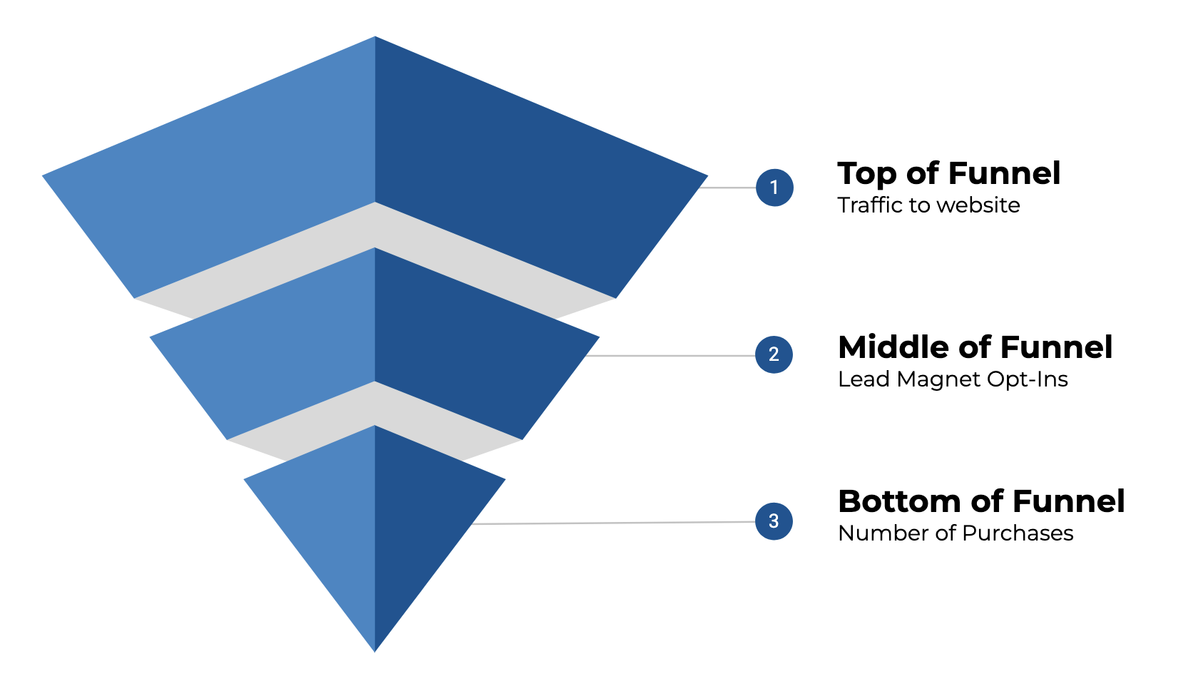
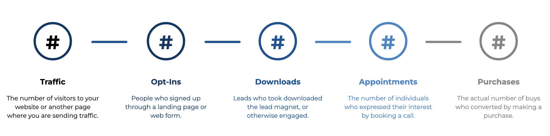
The data points you track will be specific to your business, but in general they should represent the key milestones a contact experiences as they make progress toward becoming a customer. Something like this:
Pick a few lighthouse metrics across your funnel. Think:
Keep it simple at first—three to five metrics is plenty.
💡 Tip: Choose numbers you can realistically check at least weekly.
List the platforms where each metric comes from. For example:
This is where you may start to notice how spread out your numbers really are.
You don’t necessarily need a data warehouse. A fairly simple Google Sheet could work just fine.
Set up a simple table with the metric name, the value for this week (or month), and a place to compare to past performance. Add notes if needed, like “running a promo this week” or “Facebook ads paused.”
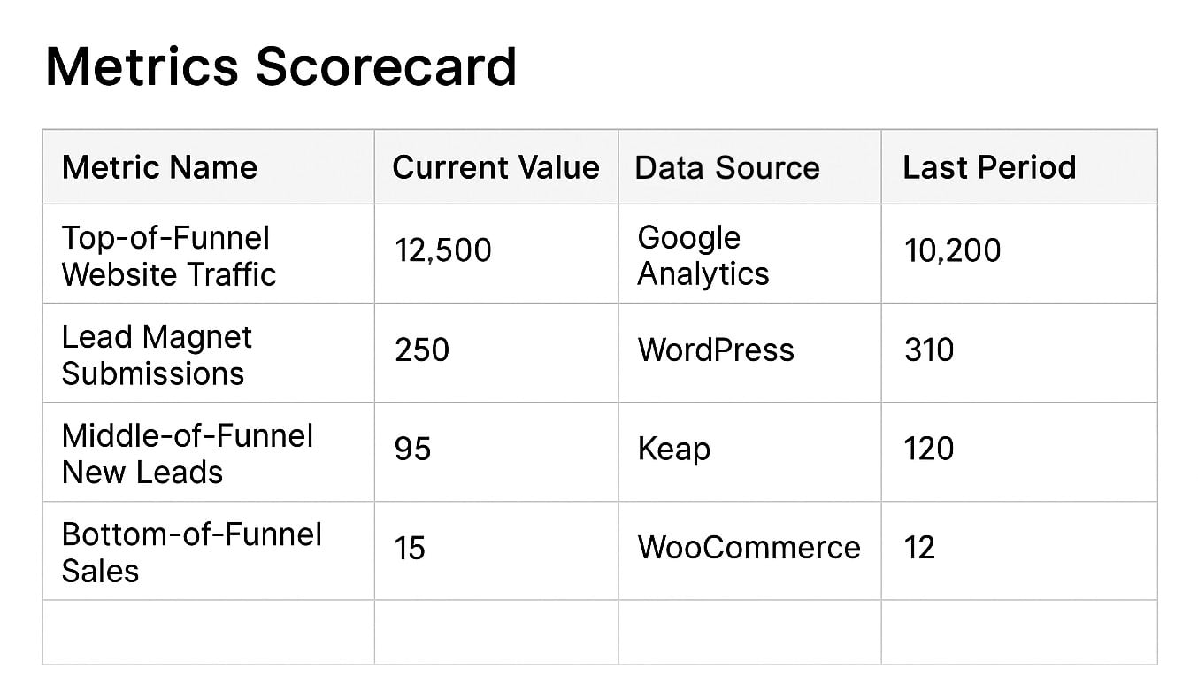
Yes, it can be that simple - though, it may be worth adding a column that also shows you the delta (the change up or down from one period to the next).
Once your scorecard exists, the real value comes from using it (novel, right?). Paying attention to these will help you identify which numbers are improving, which are holding steady, and which may be getting worse, and in need of some focus.
But if reviewing your numbers feels tedious or unclear, you’re not going to stick with it.
Here’s how to keep it going:
The goal isn’t perfection. It’s awareness.
If you’ve ever built a Google Sheet that relied on copy/pasting numbers from five tabs, you’ve already discovered the limits of doing this manually.
There are a handful, but namely we're talking about introducing errors, wasting time, inconsistent updates, and adding friction to your process of extracting insights.
That’s where automation comes in, not just to save time, but also to unlock smarter decisions.
On the flip, if your scorecard updates automatically:
For anyone ready to automate: There are tools out there that can connect Keap, Google Analytics, Calendly, and other apps to a central dashboard. One example we’ve been exploring is BlinkMetrics, which helps pull everything together for Keap users (and beyond). More on that in the upcoming webinar on August 20th.
At the end of the day, this is about trusting your numbers and trusting yourself to make decisions based on what’s actually happening.
Whether you track your metrics with a clipboard or an AI-powered dashboard, what matters most is that you’re keeping an eye on the parts of your business that matter.
If you’re not doing that yet, that’s okay. This post is your invitation to get started.
If this post has you thinking about the way you track performance in your business, and you're looking to create a reliable, less stressful way - we've got you, you can join us on August 20 for a live webinar where we’ll be diving deeper into:
And if you're already curious about whether tools like BlinkMetrics might make sense for your setup, you can explore that over here.
If you would benefit from a place to ask automation questions when you get stuck, and get ideas and inspiration from other businesses, you can join us in the Monkeypod Membership.

We have created several courses where we dive more into the technical aspects. So, if you like what you read here, you'll love our courses!!