We’re back in action with another update on the Max Classic Version of Keap (formerly known as Infusionsoft), and there are a few features I wanted to highlight this month that will make our lives easier – and one feature that I’m not as excited about. Skip to the bottom if you want to see my video recap:
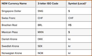 Feature #1: Additional Currency Support
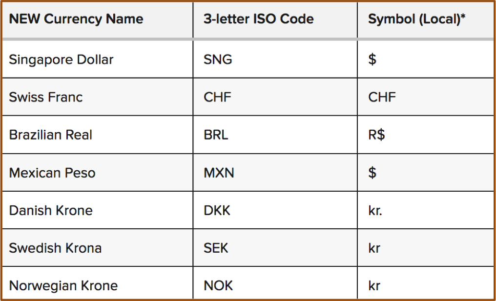
What it does: This update allows Keap users to use about a dozen new currencies that were previous unsupported.
Why it matters: Well, if you process orders in USD or AUD or the Euro, this might be less of a big deal, but if you’re in a country where your currency wasn’t supported previously, then this update just might be the ticket to allowing your customers to transact in their own local currency.
Caveat: Yes, this is exciting, and it’s a little bit of love for the normally neglected e-commerce section – but I just want to be clear that you can still only use one currency at a time.
Feature #2: The Signature Snippet
What it does: This update brings a signature block back into the email builder so you can quickly and easily drop an HTML signature into your emails.
Why it matters: This matters because if you’re sending a lot of emails, it isn’t realistic for you to have to type out your signature each and every time, and many people didn’t know about the option of using a merge field to drop in the owner’s siggy, so this makes it easy to add your information in an attractive professionally formatted way.
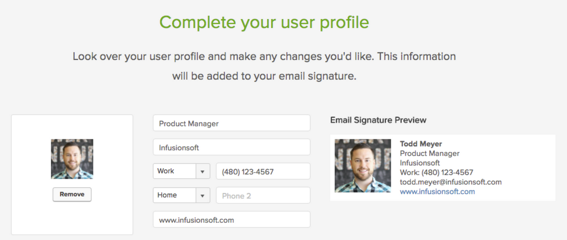
Bonus: This new signature snippet actually behaves a little differently than it did previously.
Feature #3: The Email Footer
What it does: This gives you the ability to edit the footer of all emails built with the new beta email builder.
Why it matters: This is really important, because now you can frame up the unsubscribe option to make sure that people know that they’re completely opting off your list. It also means that if you need to add a legal disclaimer of any kind, well, you can do that too.
Caveat: Yeah, I know, this isn’t really a new feature either, it’s just something that they’re bringing back – but hey, it’s pretty slick. I really like the way they’ve handled this. The one complaint I have is that the text options don’t seem to support any other fonts, sizes, colors, links, etc. You can add text language to frame up the footer, but you can’t do much more than that….yet.
 Feature #4: Automation for Quotes
What it does: Now you can trigger or stop automation when someone interacts with a quote you’ve sent them.
Why it matters: This is HUGE. Until recently, quotes were pretty basic. In fact, I didn’t know more than a handful of users who were actually taking advantage of them. But now they’re stylin’ and profilin’. This update brings us the ability to launch automation or follow-up when someone views a quote, and if they accept it, pay it, or decline it, then we can stop that follow-up and move them to a different part of the funnel. It’s really slick and makes the quoting feature much more usable.
Caveat: The drawback I see on this one right now is that it’ll get a little hairy if you have more than one open quote sent to a customer at the same time.
 Feature #5: Campaign Builder Facelift
What it does: They’ve redesigned the campaign builder and moved the tool palette over to the left side of the screen, and cleaned up the top bar to be a little sexier as well.
Why it matters: Well, it’s mostly an aesthetic change. So, I’m not sure it actually matters all that much. But I think the goal is to bring the type of interface we use with the new email builder to the rest of the application. I imagine we’ll see this type of layout and interface showing up in the landing pages and web forms before too long as well.
Real Talk: I’m the first one to say that I’m a total Keap fan boy, and I recognize that I usually cut them more slack than most people – but I’m really not feeling this update. If you’ve been a Keap user for a few years, you may remember that when the campaign builder was first introduced, they had a menu with all the different goal types, and people could select one, and then adjust the goal method to track what they wanted. You were basically just choosing the picture, because you could configure the goal however you liked.
Then at some point they cleaned it up, and trimmed it down to just one goal. And you’d drag out that goal icon then choose what you wanted it to track. Once you had selected the goal, it would automatically adjust the icon image to reflect what you had selected. I didn’t love this update because some people had gotten really attached to using different goal icons to reflect different parts of their customer journey, and this removed the ability to choose what you wanted the goal to look like.
Well, now they’ve updated it again, and with it we’ve lost some additional functionality. And here’s where I take my issue: With this new update we can no longer change what a goal is listening for, or the image that represents it. Each goal has a dedicated “method” and a dedicated “icon” and if you change your mind, you can’t click on the little badge and change it; you have to delete the goal, grab a new one, name the new one, and reconnect it to all the various pieces.
It’s not the end of the world, but I’m having a hard time understanding why this is better. Maybe it’ll grow on me with time, but so far I’m not swooning.
Alright, all in all, a pretty solid release. It’s not perfect, but that’s okay, it has a lot of things that we’ve been asking for; and that demonstrates that Infusionsoft is listening. I believe it’s our job as the user community to help guide where the product goes – and the easiest way to do that is through constructive and thoughtful feedback. If you are loving what they’re doing, tell them. And if you are concerned about something you’re not seeing, tell them that too.
Thanks for reading, I’d love to hear what your favorite aspects of this release are


Great Stuff as always Greg! I’ve actually asked this question before (not here) but I don’t remember the answer, so I figured I’d ask again for anyone else who might have the same question.
With the Quote goal. If you used the “Quote Paid” goal, I’m assuming that if you also had a “Product Purchased” Goal (say, in another campaign) that they would both be achieved and trigger whatever was after them. Is that correct?
(BTW: Love your concern about the goals… I feel/felt the same way)
Kev, good question man. Yes, I think paying a quote will also achieve a purchase goal. But let me know if that is different than what you’re experiencing!
Nicely reviewed, Greg! Just wondering if I’m the only one who thinks it would be nice to be able to ‘collapse’ that left-hand menu bar in the Campaign Builder (just to free up some space when you’re not actually dragging out elements)?
So you know, I already submitted this request to Infusionsoft using their little feedback-happy-face icon.
Oh Grant, you are absolutely not the only one. I’ve seen a handful of people campaigning for that as well.