


Love what you are seeing?
We have created several courses where we dive more into the technical aspects. So, if you like what you read here, you'll love our courses!!


By:
Greg Jenkins
|
February 9, 2026
|
Technology
Hello there fellow MonkeyPodders!
If you didn’t know, I’ve been using Infusionsoft (now Keap) since 2008. This means I have watched the software grow up and evolve.
Kind of like when you watch a dog or cat (or kid) grow up; you understand them better, and why certain things are the way they are.
Since I also worked at Keap (formerly Infusionsoft), I’ve got a unique view into how the system operates under the hood.
You are about to gain access into, arguably, one of the most nuanced parts of the software: the Keap CRM Sales reports.
For those unfamiliar, these are the reports you can use with the Opportunities function, the sales pipeline. Since that function itself is challenging for some users, it makes sense that the reporting is also a bit misunderstood.
Greg, being a former success coach like me, was super aware of this knowledge gap for most users.
And recently he reminded me of an old resource we once used as coaches, a cheat-sheet of sorts that has held true since 2013. A thorough breakdown and explanation of every CRM Sales report.
Back in 2013, I was asked to speak at the annual user conference about this Opportunity function. (Have you heard IKON is coming back?)
So, it made sense to have the report explanations available as part of the presentation bonuses.
Now, for you and all the world to benefit, we wanted to unpack that juicy detailed artifact. I give you, the Sales Report Overview…
When it comes to running a business, asking the right questions is important. These sales reports are answering some specific questions that might not be apparent to the average user. Plus, these questions are being informed by sales management experience. So if you’ve never been a sales manager, you don’t even know this is a question (yet).
Below are the 12 sales reports, the main question they answer, and how you might use this to manage your sales team. Feel free to read through them, or jump to the reports you're most interested in:
1) Sales Rep Conversion %
2) Conversion % (Created By)
3) Stage to Stage
4) Opp Created Detail
5) Call History Summary
6) Call Log Report
7) Sales Pipeline Summary
8) Sales Pipeline Detail
9) Opp Revenue Forecast
10) Opp Sales Report
11) Sales Cycle Report
12) Opp Pipeline Summary
Having a solid close rate means more predictable sales. However, looking at the rates of movement from one state to the next gives insight into the efficiency of the sales process itself.
With this report, you can choose stages in your sales pipeline and can see the percentage of movement.
For example:
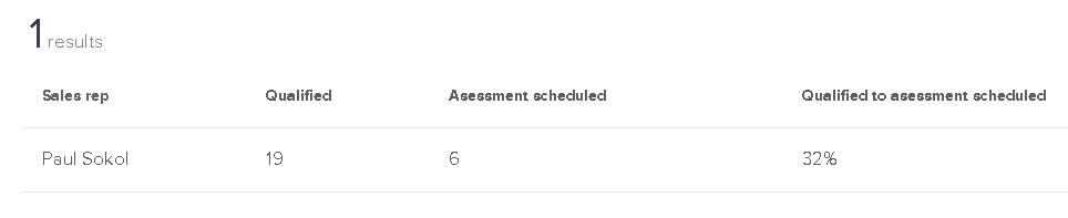
I have had 19 opportunities that made it to the Qualified stage, and 6 of those moved to Assessment Scheduled. A 32% conversion from qualified to scheduled.
This does NOT mean there are 13 lost sales though.
Look at the movement from Qualified to Assessment Complete:
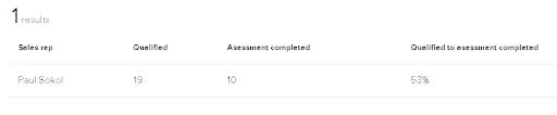
10 people moved directly from Qualified to Assessment completed.
This report is good for looking at global pipeline velocity among all sales reps, or for digging into a specific rep’s performance.
Be careful comparing more than two sales stages though! Deciphering the data with multiple stages selected can be a pain. The report basically compares all possible stage move combinations, which is a daunting data set. You’ll see an example of this complexity in the next report. Dive into at your own risk!
This report is a modified version of the previous one. You can see a stage-to-stage conversion report, broken down by users.
You’ll be able to see if automated leads (from a campaign) convert better than manual leads entered by each sales rep.
For example, my conversion rates are not much different from automated leads compared to the ones I enter by hand:
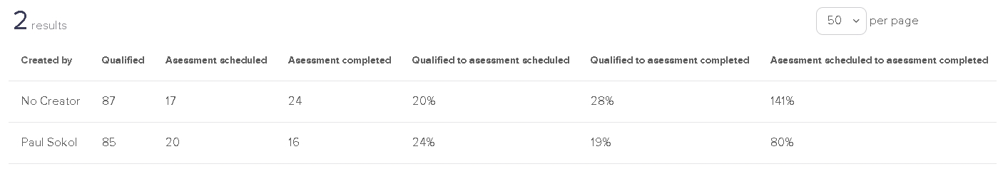
This also demonstrates the previous warning about comparing multiple stages. The data can be confusing. For example, how can you complete 141% of all assessments scheduled?
Well, there are technically 24 completed and only 17 scheduled. What this report doesn’t factor in is when people skip stages. For example if someone goes from Qualified right to Appointment Complete.
In any case, this can help you establish conversion baselines between your automated and human efforts.
This report is short and sweet. Put in two stages and a date range. The report will calculate how long it takes, on average, to move from one stage to the next.
For example, for 2020 so far, there have been 9 leads that went from Qualified immediately to Assessment Complete:
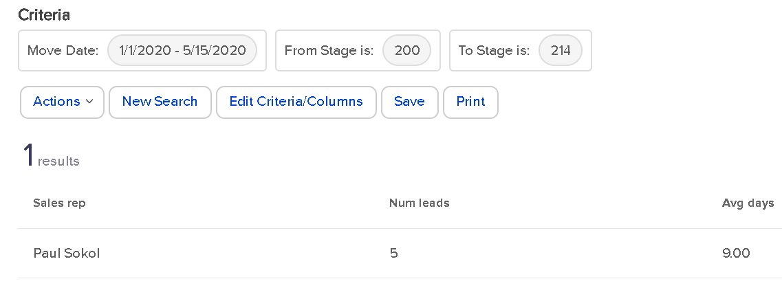
In an average of 9 days.
However, if you look at people who went from Qualified to Proposal Sent, which only happened once, you’ll see it was a fast journey for that one lead.

If there were multiple sales reps in this application, each one would have a row in the report. This means the report is also great for establishing team baselines.
This report is a bit of a wild one. It deals only with opportunities created by a User, not automatically.
For every User-created Opportunity, who has been assigned to it?
As a one-man sales team (for now), this report tells me that I’ve manually assigned myself over 200 leads:
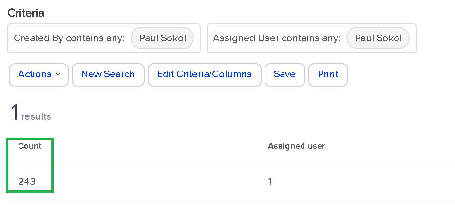
That’s pretty wild. From a real-world standpoint, there might be some use cases for looking at who is creating and assigning. For larger sales teams, this could be super handy to track multiple managers and their teams. Especially if the managers are creating the leads for their team members.
This report is great for managing a team.
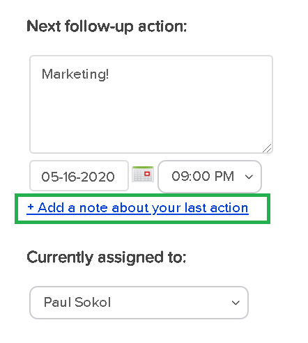
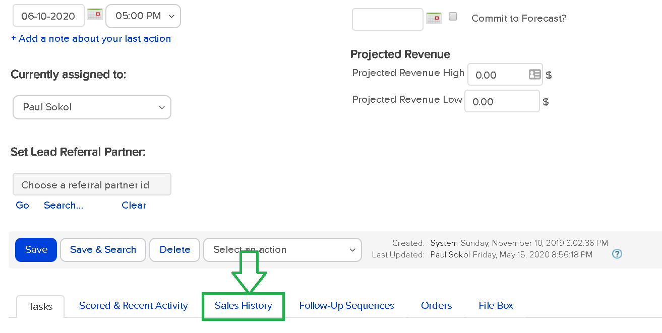
When “properly working” an Opportunity, this report will show sales reps activity. We consider working an Opportunity with the following button “proper”:
This is for 2 reasons:
Please note that working an Opportunity from My Day view will also behave in such a way.
Ok, assuming your sales team has been been trained to use Opportunities “properly”, this Sales report will look like this:
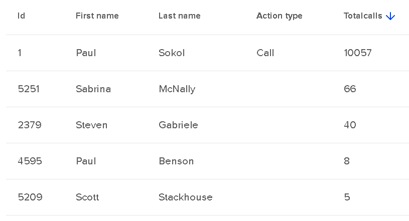
This screenshot above is for the entire app’s existence. In the close to a decade this app has existed, I’ve left over 10k contact notes of the ‘Call’ type; these are the default note type when working an Opportunity. You can see that a few other people have lightly used Opportunities in this app’s career.
As a sales manager, you can use this report to keep track of call volume per sales rep on a weekly, monthly, quarterly, etc. basis.
This report is great for digging into sales rep performance and quality of call notes.
It is basically an expanded version of the previous report. Instead of spitting out the number of calls made, this allows you to look at the call notes directly.
For 2020, I’ve “made 811 calls” or rather, worked opportunities 811 times:
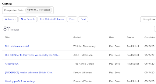
It is important to understand that these reports are reporting on the Contact notes. So as long as your sales reps are leaving notes, this should show their activity.
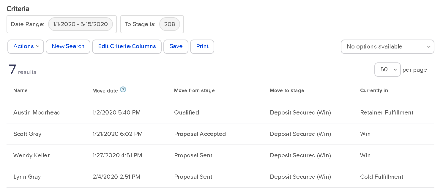
This report is pretty cool. You can see a breakdown of all stage moves INTO a stage, and then all the resulting moves OUT.
This is handy to see where people are getting stuck in the sales process. And with what velocity.
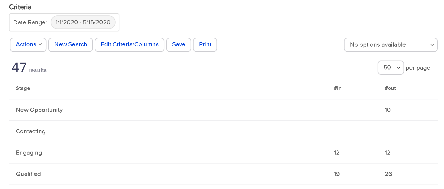
For 2020 so far, I’ve had 10 sales leads created in the New Opportunity stage that exited that stage. That doesn’t tell us much.
Could some leads be sitting in New Opportunity that haven’t moved? Yes. That would be the job of the sales manager: to monitor and make sure this isn’t the case; which it isn’t.
Look at the Engaging stage though. All 12 leads that entered that stage moved out of that stage. This means people aren’t getting stuck there. This can also be interpreted as no Opportunity was created in that stage. As long as nobody is still in Engaging (they aren’t), then, yes, that is the case.
For the Qualified stage , how can 26 move out when only 19 went into that stage? This means there were 7 opportunities created in the Qualified stage from the get-go. At least.
As you can see, this report starts to get down to the brass tacks of pipeline efficiency.
There are no search parameters besides the time range. This is global for all Opportunities in that time range.
However, you can filter by Team, which is a group of Users. If you wanted to see individual sales rep performance, you could create a unique Team per sales rep and use it in this report.
This report is super insightful. You can get lost in rabbit holes for sure. This report is how you can search between the individual Stage Moves; the Sales History tab of the Opportunity record.
This report lets you see global stage movement, all movement FROM a particular stage or, all movement TO a particular stage.
For example, here are all the stage moves for 2020 that ended in the Deposit Secured stage:
You can see that most people were in a proposal stage before becoming a paying client. Which makes sense. This also shows what stage the Opportunity is in right now.
For this example, since two of the stages are in Win, that means those projects are closed out. Otherwise they would still be in a fulfillment stage.
Like the Sales Pipeline Summary report, you can only filter by Team. So if you wanted to look at individual sales rep activity, you’d have to make them into their own Team.
This report is the most intricate of all the sales reports, in my opinion.
To get data from this report, you have to be doing three things:
For example, this Opportunity record has products listed and a close date:
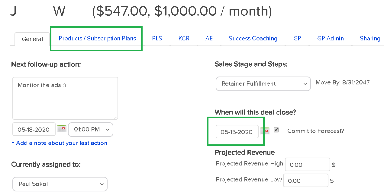
The dollar value next to the name is a function of the products and subscriptions selected.
Assuming those three conditions, the Opportunity Revenue Forecast in Infusionsoft will spit out a report like this:
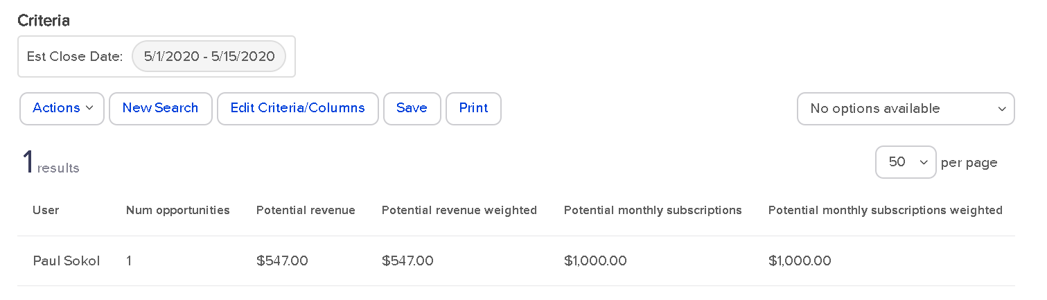
As you can see, I don’t use the Products/Subscriptions tab as good as I probably should. I am actually human after all ;)
But that works out for you, since it provides the perfect example for how this report works.
You can see the potential revenue and potential monthly subscription. This matches with the Opportunity record. You also have the option to filter based on the ‘Commit to Forecast?’ checkbox or not.
What's with that weighted revenue stuff?
Glad you asked. That is a hidden fourth condition for the report to properly work. This is related to the Probability setting of each sales stage.
If you never noticed, there is a Probability field for each sales stage when setting it up:

This is the probability of the sale closing.
So the weighted revenue is the total Opportunity revenue times the probability of selling.
As an example, if someone was considering a $1,000/month service, and they were in the Qualified stage (with a probability of 50), the weighted revenue would only be $500; they are only half way through the sales process.
The reason both the potential and potential weighted revenue match in the screenshot above, is because they are an active client in the ‘Retainer Fulfillment’ stage; which has a probability of 100. They already bought and are a paying client.
This report is particularly helpful for sales manager dashboard stats that show pipeline volume.
This report shows how many Order records exist for a Closed opportunity.
Which does not mean that every opportunity contributed to the sale.
That is what makes this report sometimes slippery. Especially if someone can buy on their own without talking to a sales rep for some Offers. There is a risk that an Order record is being “credited” to an unrelated Opportunity record.
With that in mind, here is how the report looks:
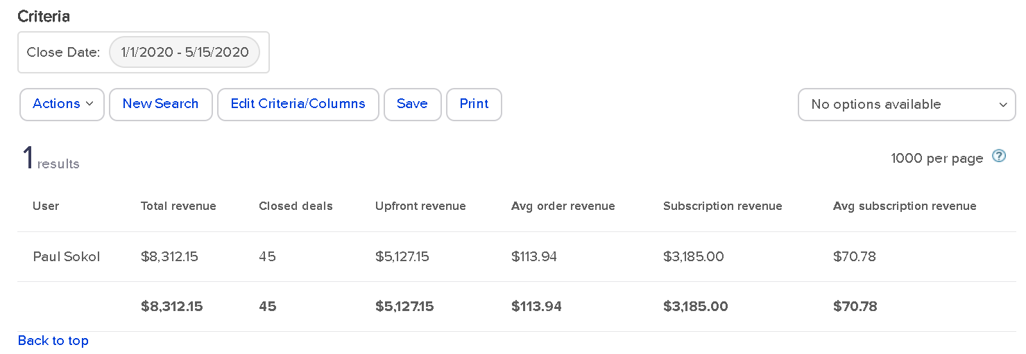
This means that I’ve got 45 closed Opportunities this year for a total of about $8,300 in orders. And about $5k of that came from upfront revenue.
Nearly every Order is a function of our assisted sales process, so this is pretty accurate.
There is an extra gotcha: this report only shows “Closed” opportunities. It has to be in either the Win or Lost stage. Because I use stages for Fulfillment, beyond the sale, this report isn’t 100% accurate.
To be accurate, all closed projects for 2020 have driven ~$8,300 so far. There are still a handful of open projects including retainers who technically never “close” until they cancel their subscription.
Still, this report gives some interesting data on sales results per rep.
This report shows how many opportunities have gone from creation to a closed sales stage, and the average time to get there.
For 2020, this is how the report looks for me:
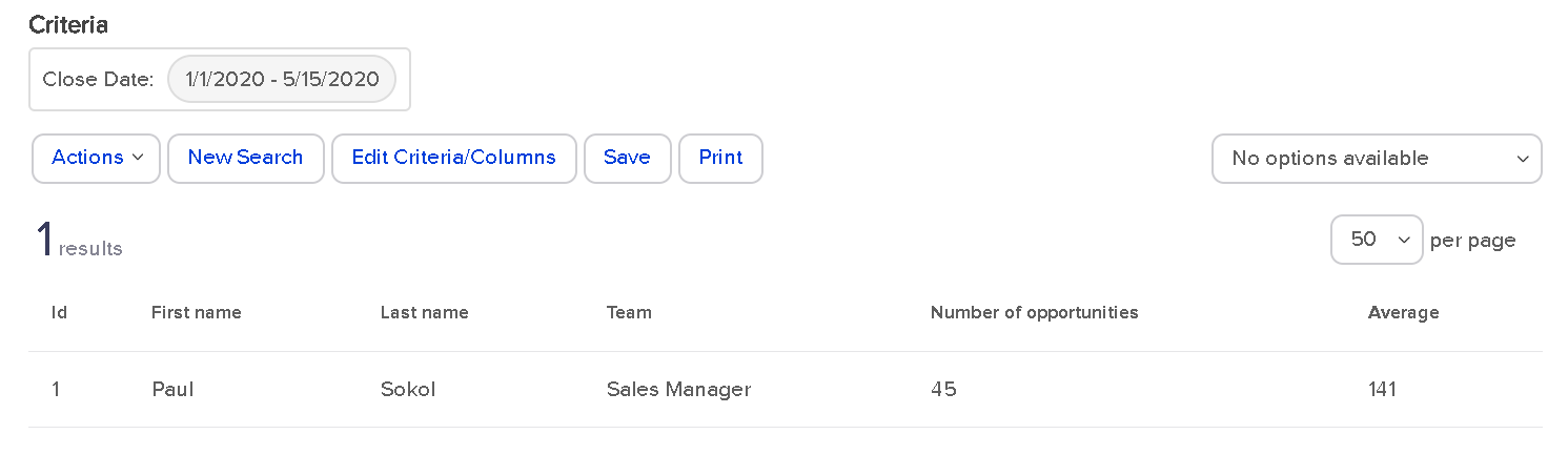
45 Opportunities have been closed out in an average of 141 days.
This doesn’t exactly tell me, specifically, the sales length though. Remember, I use sales stages for Fulfillment, so technically the Opportunity is active throughout the whole process.
If I wanted to see the specific sales cycle, I would have to use other reports to see the average time to the Deposit stage.
For a more traditional use of Opportunities, where the record is closed upon sale, this report gives a fantastic high level view of sales process velocity and efficiency per rep.
This report is the big mamba jamba. It’s the closest thing you have to a speedometer for your sales pipeline.
There are no settings for the search. There are no extra columns to add. This is a raw “What is so?” right now about your sales pipeline:
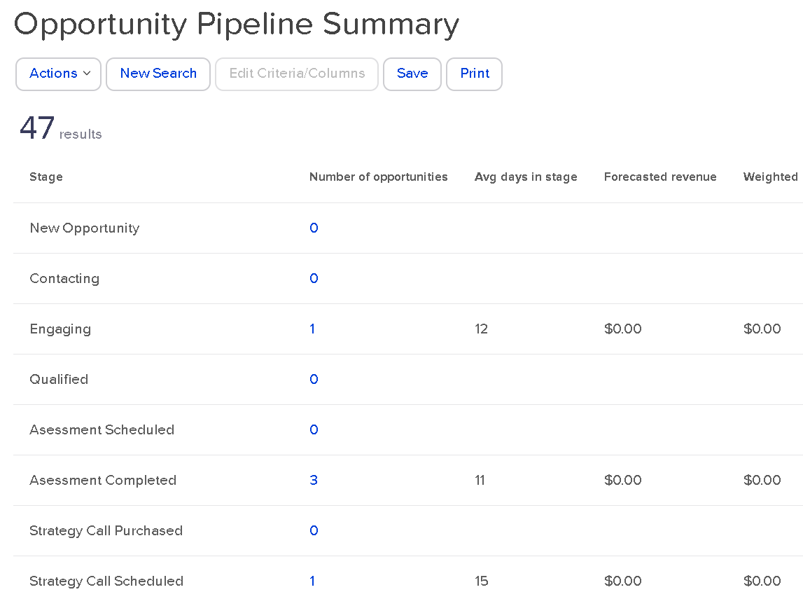
Right now, as of this blog post draft, I have one person in Engaging for 12 days so far. 3 in Assessment completed. And so on.
You can see I’m not adding in the forecast revenue to those Opportunity records. This is a great reminder to get into this habit. Even as a one-man show, the more data I have, the better :)
This report gives you a high level view of everything, right now. If I was a sales manager, I might use this report as a Tool to build the team as a whole. Keep everyone all on the same bus. Everyone wins together, and everyone loses together.
Whew!
So there you have it. From the annals of an esoteric PDF produced in 2013, you now have a full-blown explanation of every single Sales CRM report for Keap. All twelve of them.
Arguably, one of the most thorough and rigorous explanations of the topic to date. :)
What do you think? What'd you learn? What questions do you have? Let us know in the comments below.
We have created several courses where we dive more into the technical aspects. So, if you like what you read here, you'll love our courses!!