Professional Digital Tracking

Professional Digital Tracking

I’m pretty excited about today’s post because it covers the heavy-duty topic of digital tracking, which is akin to black magick if you don’t know how it works.

As a warning, there’s a lot in this post, and it builds as we go on – so depending on your experience some of it may feel like review. And to help bring this to life, we’ll also include a variety of examples. Here are some quick links if you want to jump around:

Let’s start fairly simple.

What Is Digital Tracking?

A business’ website exists to serve the business. A website is a powerful Marketing tool. It can be a powerful Sales tool. And, depending on the kind of Offer(s) you provide, your website can also drive your Fulfillment process.

If your business has a website you would be absolutely foolish to NOT have insight into what people are doing when they visit.

What pages they go to, from where, for how long, and what kinds of behaviors they take (opt-in, purchases, etc.) is objective data. That data is critical to helping you understand if your various efforts are working.

Digital tracking is how you collect this kind of website visitor data.

The de facto standard for digital tracking is Google Analytics. I use it, all my clients use it, Monkeypod uses it, and I would recommend you do too. The tool is free, built to handle more traffic than you will (likely) ever be able to amass, and lightweight so that your page load speeds are not slowed down by the data collection.

All you have to do is install a small tracking script into your website’s code.

How does Digital Tracking work?

he easiest way to think about it is to go back to kindergarten.

Remember when the teacher would pin a note to your shirt for your parents when you got home, because you were too little of a tyke to reliably share stuff? Digital tracking is like pinning a note to a link anytime you point it back to your website. You can pin up to five notes actually (see the next section).

Whether your link is in an email, from social media, in a direct mail piece, behind a QR code, behind a shortened link on a billboard…you can ALWAYS track from where your website visitors came. And IMHO you always should.

The magic is in the URLs themselves.

If you’ve ever paid attention to a link and noticed stuff like “utm_source=BP-05-2025” that’s like a little note being pinned to a link so the website operator can understand where that traffic came from.

Later, the website operator can go into Google Analytics and look for traffic that came from any sources with “BP-05-2025” and see what those specific visitors did.

How do I implement Digital Tracking?

Google Analytics allows you to “pin” up to five different utm parameters to any link so you can analyze the link’s performance:

  1. Source – The highest level of tracking distinction. I recommend using the publishing source for this value (e.g. Facebook, Hulu, New York Times).
  2. Medium – This is the next highest level of distinction and should be platform agnostic. For example, every Source above could have “ad” as the medium. You will be wise to note that when digging into Google Analytics data, you can view things by the Source/Medium pair of utm parameters. No other parameters have this kind of paired view.
  3. Campaign – I recommend thinking about this as the main asset itself. For example, if I had a free report with various calls-to-action on different pages, I would set the Campaign as the name of the free report.
  4. Term – This should reference the specific piece of the main asset where the link is actually found. Keeping with the free report example, I would set the Term as “pageX” where X is the specific page the link is found.
  5. Content – This should be unique for every instance of the link. Even on a single page of a free report, there might be multiple instances of the same link. For example, the header and footer of each page might have the same call-to-action. In that case, the Content could be set to “header” and “footer”, respectively.

As you can imagine, in order to get meaningful and usable data, you want to be consistent with the parameters you use between marketing efforts because you can technically use anything you want. If you have a team, you must create some kind of document or spreadsheet that tells people what utms the business is using.

Over time with consistent utm schemas, your Google Analytics will form a rich tapestry of website visitor data that you can dive into for insights.

Can you help me visualize it…

This is very heady, especially if you aren’t used to crunching data and numbers.

Think of UTM parameters as an upside-down pyramid with five levels, each narrowing down to the specific link click.
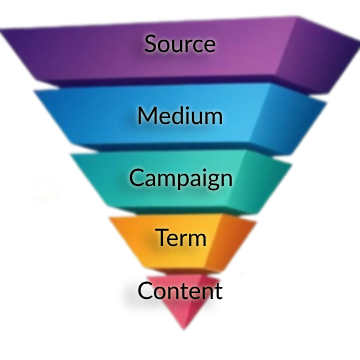
 

Upside Down Pyramid with Tracking Schema
These are the five notes pinned to the shirt of every link you put out in the world.

Example 1: Tracking with CRM Emails

Anytime a blog post is published, I email our list about it. Usually more than once. To track the effectiveness of those email announcements, I have used this particular utm schema for years.

CRM link tracking schema
This schema will allow me to not only track which specific email drove the click, but which specific link in that email did the job.

[Back to Top]

If it helps to visualize with the pyramid, one blog post announcement email that links to the article via the featured image AND a text-based CTA can be thought of like this:
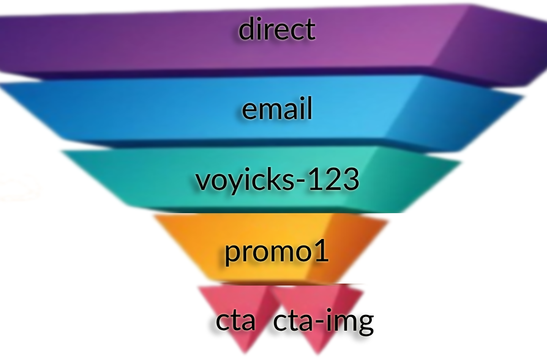
two link pyramid tracking
All UTMs are the same in the email except the text-based CTA has a Content of ‘cta’ and the linked image to the same article has the Content ‘cta-img’. This will answer the question of “Do people get to the blog post by clicking on the featured image in the email or the linked text?”

Example 2: A PDF With A Call-to-Action On Every Page

Imagine you have a 20 page PDF. Now, imagine the header and footer of every page has a call-to-action for people to visit a sales page on your website.

20 pages times two links per page is 40 links throughout the whole document.

If you want to Be Pro about things, you would ensure that every one of those calls-to-action is uniquely trackable via utms even though they all direct to the same destination.

The pyramid visual for the first two pages would look something like:
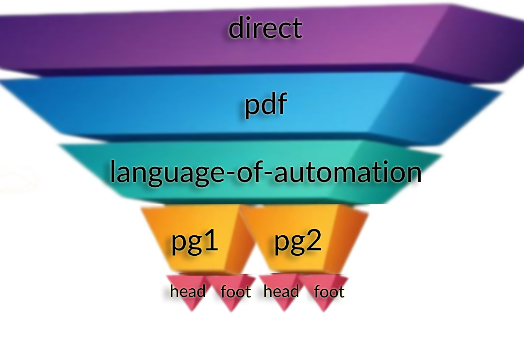
PDF Link Structure Example
In this case, the Source, Medium and Campaign utms are all the same. Then, each page is its own Term using the same “head” or “foot” Content parameters. Now, not only can we see if more people are clicking the header or footer, but WHICH PAGE is actually getting people to the website.

Example 3: Ad Campaign Tracking Swipes

Let me be as clear as I can: If you are doing any kind of Meta or Google advertising (or anywhere else for that matter), you absolutely 100% need to be using utms in an intentional way.

Anytime we run ads for ourselves or clients, we use the OAC Framework; Objective, Audience, and Creative.

In that case, the Source is always the ad platform and the Medium is always “ad”.

Then, the rest of the utms directly correlate to the OAC distinction:

  • utm_campaign  is the name of the advertising campaign where the Objective is set.
  • utm_term  is the name (or ID) of the Audience settings.
  • utm_content  is the name of the specific Creative people see; the raw ad itself.

Using utms in this way allows you to directly analyze your paid efforts and do win-loss analysis much easier.

Here are the tracking parameters we use for various common platforms. You can literally copy/paste these into the appropriate places in the ad platform. If you need help with these please reply and let me know!

Google Ads:
{lpurl}?campaignid={campaignid}&adgroupid={adgroupid}&keyword={keyword}&device={device}&utm_source=google&utm_medium=ad&utm_campaign=campaignId-{campaignid}&utm_term=adGroupId-{adgroupid}&utm_content={keyword}

*If you are advertising on YouTube, update the utm_source to be youtube

Bing Ads
{lpurl}?utm_source=bing&utm_medium=ad&utm_campaign={CampaignId}-{Campaign}&utm_term={AdGroupId}-{AdGroup}&utm_content={TargetId}-{AdId}

Meta Ads
?utm_source=meta&utm_medium=ad&utm_campaign={{campaign.name}}&utm_term={{adset.name}}&utm_content={{ad.name}}+-+{{ad.id}}

LinkedIn Ads
?utm_source=LinkedIn&utm_medium=ad&utm_campaign={{CAMPAIGN_GROUP_NAME}}&utm_term={{CAMPAIGN_NAME}}&utm_content={{CREATIVE_ID}}

So simple my Mom uses it…

My mom is a leading educator around medical simulation for nursing students. She has been teaching this stuff for well over a decade and has written a lot of articles on the topic. Every time she writes an article, she promotes it on LinkedIn because that is where she hangs out professionally online and networks with other professionals.

A few years ago, I encouraged her to start building her own list so that she would not be reliant on LinkedIn for getting the word out about new articles. The idea is simple: anytime she has a new article she publishes it and then emails her list about it to drive readership & conversation.

I helped her build a simple landing page for people to join her list, and then helped her build out a weekly chain of articles she had already published. Then after new subscribers make it through, they are all caught up and will be notified of new articles as they come out.

Keap Campaign Kathy Sokol

By now, she has nearly a full year’s worth of weekly articles. I’m super proud of her and a little jealous I haven’t done this for my own business. Classic cobbler’s kid problem #AmIRight?

Also, to Be Pro about it, I added proper Google Analytics tracking to the article links in each email.

For example: https://www.healthysimulation.com/52522/concept-mapping-healthcare-simulation/?utm_source=keap&utm_medium=email&utm_campaign=kathy-sokol&utm_term=concept-mapping&utm_content=thumbnail

The extra utm_stuff after the “?” in the url are the tracking parameters for Google Analytics 🙂

[Back to Top]

Hold On A Sec…That Isn’t The Schema Your JUST Shared Paul…

You noticed that, huh? Well, there is a reason for that.

If you look at the link above, it is pointing to HealthySimulation.com. My mom does not own this website, she is simply a guest contributor. She will NEVER get access to that company’s Google Analytics.

That doesn’t mean she still can’t prove her own promotional efforts with this publisher. By seeding her own utm parameters, rather than leave it up to fate, whoever does their web traffic analysis will be able to see exactly how many clicks her emails specifically drove to that article.

Put another way, this means she can prove to this publisher (and others in the future) that her articles are genuinely driving web traffic with her own promotional efforts.

Since we are here, and because we love my mom, go ahead and give that article link above a little click-a-rooney-doo to give that guest post a spike in traffic which will make her look cool.

Editor’s Note:

A moment ago we linked you to Paul’s resource defining the OAC acrynoym, and how that framework helps you define the Objective, Audience, and Content. Did you click that link? If you haven’t, go ahead and click it now – if you look carefully you’ll see that I updated the URL parameters so that when Paul checks his traffic, he’ll be able to differentiate traffic sent this this page from Monkeypod from traffic generated by his other channels.

Those Links Look Crazy, Is That Hard To Make?

Nah. Google has its own UTM Builder tool that I’ve had bookmarked for probably a decade by now. I’d recommend you bookmark this now too.

Simply paste in the link you want to track, input the source/medium/etc. and then you can copy the link beneath and use it wherever you want.

In fact, the screenshot from example #1 above is the UTM builder tool.

Pinning Little Urchins To Any Link

In case you were wondering why they are called “utm” parameters, there is a fun & short history lesson here.

The Google Analytics technology was not developed by Google. A company called Urchin was the original developer of a tool for this kind of website tracking. You installed their tracking script on your website and then appended the various parameters to the links you wanted to track. Those parameters were called Urchin Tracking Modules. UTM.

Google acquired the company in 2005 and turned it into Google Analytics. They chose to keep the same utm_source/medium/etc. parameters. The rest is history.

[Back to Top]

Ok…I Can Seed The Tracking Data But How Do I Analyze It?

Another smart question.

Attaching those utms to links is great because that starts pushing the data YOU want to see inside Google Analytics. Looking at the data is a whole different kettle of fish. Mostly because there are SOOOO many ways to slice and dice the data that whole books have been written on the topic.

There is way more to cover about website traffic analysis than I would ever want to write about in a single post.

Fortunately, a few months ago on our bi-monthly Knights of Automation Mastermind, my friend Heather Wells and I spoke about this exact topic. The first part of the mastermind covers how utms work, which you’ve already learned about in this email. Starting about 15 mins into it I explain HOW to dig into the utm data.

What’d you think?

I know there was a lot here – so feel free to take your time and re-visit any sections that felt intimidating. I’m passionate about this topic because I know the difference it can make for business owners who want to take this seriously, and benefit from the insights it makes available.

Are you starting to now see how powerful digital tracking can be when done right? What questions do you have for me? Is there anything you’d like me to clarify?

No matter how big Be Pro grows, I plan to personally read and reply to all questions that come in for as long as I can. You can comment on this post, or reach out here if you have additional questions I can help with.

[Back to Top]

Want more?

If you want to learn how to lay the groundwork and install digital tracking, I did a presentation for a WordPress conference showing how to install Google Analytics and some other tracking pixels (Facebook, Google Ads) using Google’s Tag Manager. Watch it here:

Have your own questions?

If you would benefit from a place to ask automation questions when you get stuck, and get ideas and inspiration from other businesses, you can join us in the Monkeypod Membership.

Takeaway Lessons from T&C 2022

Takeaway Lessons from T&C 2022

I used to spend a lot more of my time going to conferences. It is part of how I stay in the know on some of the latest trends and technologies. Lately, not so much.

But a couple weeks ago, I went back to my first in-person conference in almost three years and it reminded me why I have to do these things.

I found renewed motivation and excitement for what is going on in the industry.

I networked and talked with others who actually know what I do, understand my challenges, and can speak my language (My parents still think my job is made up…).

I have ideas flowing and my task list for my business, QBR, is growing.

So I wanted to share a few of the things I wrote down with you in case it sparks some ideas you need to jump on board with or get going for your business.

conference notes

Trends

  • Person focused– Just like me not being at a conference in several years, everyone is missing and craving some of the social and human interaction that is meaningful and real. The more you can add real human touch and emotion into your business, the more your audience can feel connected and relate to what you have going.

  • Sales cycle is getting longer across the majority of industries. This means that people are still buying but they are taking longer to get to that decision. The best thing you can do for this is to make sure your customer journey is prepared for this.

    Is your message clear and consistent from start to finish? Do you have lots of value and nurture prepared in their journey? (Here’s a great course if you want to revisit the process of planning out your customer journey.)

  • Flip the funnel– You will still bring people into your list with a free offer, but you can ask for your big sales quicker, but only from those who are really ready to buy. This means you have to know your audience well and know if they are ready to buy. More than ever, you need to ask a qualifying question up front to see if they are your ideal customer and in the right mindset to buy. If they are, start by offering your higher priced product and then go lower.

If they aren’t ready to buy right now, give them lots of value until they are ready instead of offering them lower priced products first.

Content

  • Email is still not dead and even making a comeback. But like everything else, you have to make it human and personal again. People are looking for real human touch behind everything.

Talk to your people and ask them before sales what their biggest challenge is right now?

You can automate things like sorting questions

“Are you more focused on X or Y right now?”

But then use that info – you can tailor their follow-up automation with dynamic content, and be ready for them to reply. You will need a real human to be able to answer any emails they send to keep those conversations going.

Keep them talking by asking them questions like, “Are you interested in…, and “Can you tell me more about…”

  • AI content is here, and only getting more powerful – honestly, it is pretty freaking cool. No, it isn’t perfect, but it can make writing go much faster if you are person who doesn’t love content, but you still need content.Blogs and videos should be feeding your content machines. It has never been a secret that content has been a big part of business but making sure you are using all the cogs (your website, blogs, social media, YouTube, Reels, all of it!) to work together to work as machine and interlinking everything is what keeps the business going.

    I know this can feel exhausting, but you don’t have to keep recreating new stuff. Find your pillar content and then repurpose it. And do it again and again.

    And use the technology out there to help you – like this one for Keap users.

social media icons

Social Media

  • Video is here to stay, so be your beautiful, weird self! (advice I still regularly give myself, btw)

Short videos and reels are one of the most popular and predicted items from almost every session I went to. This means that if you haven’t looked at reels and YouTube for your business, it might be time to take another look.

  • You will always be rewarded for using new features by the platform algorithm, so don’t be afraid to jump on and try new things-even if they don’t last.
  • PPC prices are increasing.
  • Organic social is harder than ever, and to gain traction with it, you must post…A LOT. Just keep that in mind if this is the strategy you are looking at for growth.

Design a plan you can stick to – what channels will you use? How often will you post? What types of content can you produce? Then put together a calendar that helps you stay with it.

Getting consistent with social media is a challenge for me – and for most people. But fighting intertia to get started is the hardest part, and the benefit is that once you’re in motion, the platforms reward your regular engagement, which helps you sustain the momentum.

codi laura and jamie at happy hour

Connections

I’ll also add that one of the most valuable aspects of any conference is the ability to connect with people – either friends you already know (but mostly see online), or meeting new people, who may turn into meaningful long-term relationships.

This part of the conference is generally a little less predictable (there isn’t as much of a planned itinerary) but to me it’s just as valuable. Even as someone who is generally introverted, I find the social aspect recharges me, and the conversations are often just as rich and valuable as what happens in the actual event breakout sessions.

If you are looking to implement any of these or need support in your business, reach out or book a discovery call, and I would be happy to see if we can help take something off your plate.

I also want to encourage you to challenge yourself to invest in yourself and your business again, especially if it has been a while.

Get going on that project that has been on the back burner. Get in a room with others who inspire you. Make a move!

How to Get More People to Start and Finish your Course

How to Get More People to Start and Finish your Course

Recently I saw a thread on twitter from my friend Bernardo Feitosa where he dug into ‘cracking the engagement code’ for an online course he offers.

The Results: 5x more course participants engaged, and 16x more completed the course.

The thread covers how they did it – it was so valuable I asked him if I could turn it into this blog post – he said yes (obviously).

Note: If you want to see the original thread on Twitter you can do that here.

It all started with this masterful set-up:

Here are the following steps Bernardo outlined:

1. Commitment Form

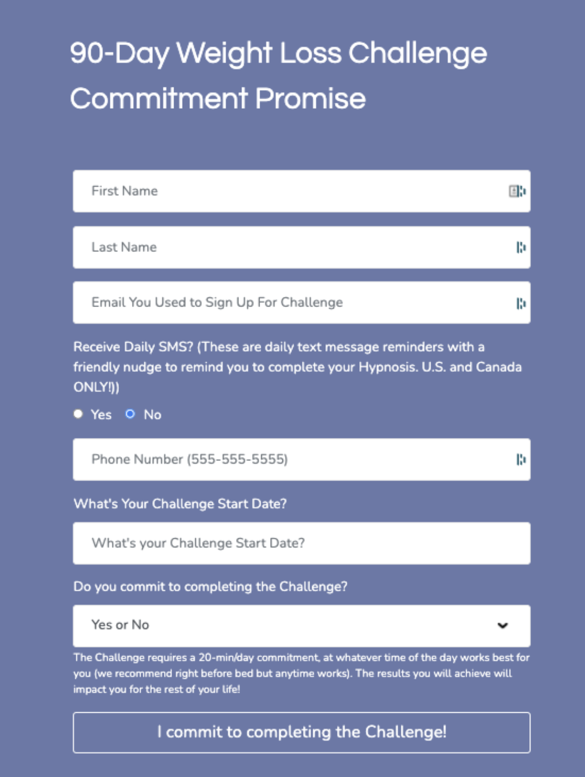
1/ Commitment Form: If you want someone to do something, why not make them promise?

Commitment Form

2. The Relentless Sequence

2/ The Relentless Sequence: There’s only ONE goal to this sequence: sign the commitment form.

I won’t show a single piece of content from the course before they commit to completing it. Getting this level of buy-in from every student was a game-changer.

Relentless Sequence

3. The Magic Email

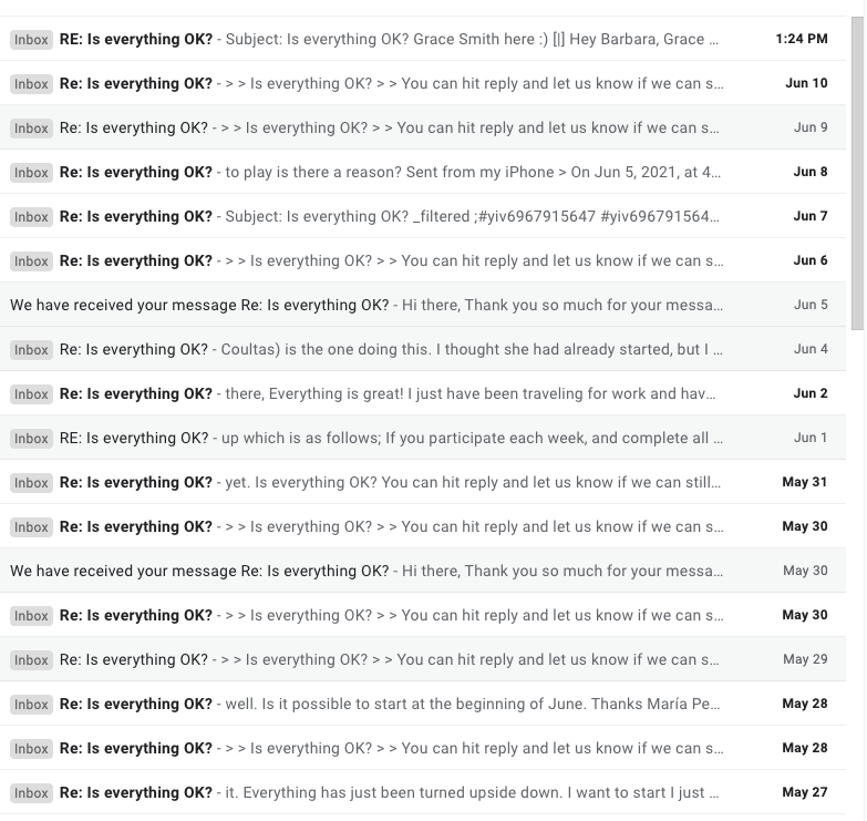
3/ The MAGIC email: “Is everything OK?” We’ve delivered emails over 10M times, and in all of that history, one email has the highest response rate ever… This is it:

Magic Email

3.5/ This “Magic” email is so good that every day I see new replies in our inbox, with customers saying how grateful they are that we’re following up.

Magic Inbox

4. SMS Reminders

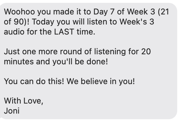
4/ SMS Reminders Because our course is a daily challenge, we send daily SMS. For a regular course weekly might be better.

So it wouldn’t be annoying, we had people opt-in to these via the commitment form. 60% of all students say YES to daily SMS.

SMS Reminders

5. Lessons Learned

5/ Lessons I learned:

* It was worth it. Our upsell rate has doubled. Not doing that would have been leaving money on the table.

* Don’t be afraid to follow up. Clients actually appreciate it. You’re helping them.

* Keep it simple. Don’t overwhelm them with too many steps.

6. Why not a cohort?

6/ We have a high-ticket cohort based course with 90%+ completion rates. Cohorts are the best to maximize completion rates.

For this lower-ticket course, we needed the strategy to be evergreen.

7. What was the Tech Stack?

7/ Tech stack:

* All automation was done via Infusionsoft, SMS was integrated with PlusThisandTwilio

All could be done with other CRMs like HubSpot, ActiveCampaign, etc.

* This course is on WP with Memberium but I also use Thinkific for cohort courses.

Other options: Teachable out of the box and AccessAlly by Nathalie Lussier for WordPress.

Want it done for you? A top notch consultant like Brian Keith can help you implement.

Bernardo is (obviously) a super smart guy, and this thread was packed with valuable information that he shared generously.

If you found it valuable, you can:

1. Retweet and tag course creators who could benefit from this strategy

2. Follow him @BernFeitosa to see more of his journey

Bernardo Feitosa
Introducing Slottable

Introducing Slottable

Picture this:

Your company is holding an event with slots available on three different dates. And the three date options are at different locations or can host different amounts of people.

Not far-fetched is it?

So why is it so hard?

We run into scenarios like this from time to time in The Monkeypod Grove. A seemingly easy concept — Hosting an event with slots to fill — is for some reason actually kind of hard to execute and automate using Keap and Calendly and other fun tools like these.

Grovers are constantly explaining their unique issues, and lots of brilliant OGs have had to come up with some sophisticated campaign manipulation to make it work the way we want it to for these unique use cases.

But it shouldn’t be that hard. All we want is to display each slot, when/where each session is, show many are left, and kick off some automation. And it was hard.. until now.

Introducing Slottable. A ridiculously simple tool made solely to solve this simple, yet common, problem.

We asked our good friend Bryce to do a demo for us:

Okay ya’ll – that’s Slottable.

It’s quick – easy to use – and solves some real world problems for folks who need slot scheduling.

If you’re interested, check out the details, or jump in on their free trial here.

Questions, comments, compliments? Drop em below.

How to actually use the CRM Sales Reports in Infusionsoft

How to actually use the CRM Sales Reports in Infusionsoft

Hello there fellow MonkeyPodders!

If you didn’t know, I’ve been using Infusionsoft  (now Keap) since 2008. This means I have watched the software grow up and evolve.

Kind of like when you watch a dog or cat (or kid) grow up; you understand them better, and why certain things are the way they are.

Since I also worked at Keap (formerly Infusionsoft), I’ve got a unique view into how the system operates under the hood.

You are about to gain access into, arguably, one of the most nuanced parts of the software: the Keap CRM Sales reports.

The Keap CRM Sales Reports

For those unfamiliar, these are the reports you can use with the Opportunities function, the sales pipeline. Since that function itself is challenging for some users, it makes sense that the reporting is also a bit misunderstood.

Greg, being a former success coach like me, was super aware of this knowledge gap for most users.

And recently he reminded me of an old resource we once used as coaches, a cheat-sheet of sorts that has held true since 2013. A thorough breakdown and explanation of every CRM Sales report.

Sales Report GIF

Back in 2013, I was asked to speak at the annual user conference about this Opportunity function. (Have you heard IKON is coming back?)

So, it made sense to have the report explanations available as part of the presentation bonuses.

Now, for you and all the world to benefit, we wanted to unpack that juicy detailed artifact. I give you, the Sales Report Overview…

Using Sales Reports to Answer Questions

When it comes to running a business, asking the right questions is important. These sales reports are answering some specific questions that might not be apparent to the average user. Plus, these questions are being informed by sales management experience. So if you’ve never been a sales manager, you don’t even know this is a question (yet).

Below are the 12 sales reports, the main question they answer, and how you might use this to manage your sales team. Feel free to read through them, or jump to the reports you’re most interested in:

Sales Rep Conversion Percentages:
“What is the conversion rate from one sales stage to another?”

Having a solid close rate means more predictable sales. However, looking at the rates of movement from one state to the next gives insight into the efficiency of the sales process itself.

With this report, you can choose stages in your sales pipeline and can see the percentage of movement.

For example:

Sales Rep Conversion Percentages

I have had 19 opportunities that made it to the Qualified stage, and 6 of those moved to Assessment Scheduled. A 32% conversion from qualified to scheduled.

This does NOT mean there are 13 lost sales though.

Look at the movement from Qualified to Assessment Complete:

Sales Rep Conversion Percentages

10 people moved directly from Qualified to Assessment completed.

This report is good for looking at global pipeline velocity among all sales reps, or for digging into a specific rep’s performance.

Be careful comparing more than two sales stages though! Deciphering the data with multiple stages selected can be a pain. The report basically compares all possible stage move combinations, which is a daunting data set. You’ll see an example of this complexity in the next report. Dive into at your own risk!

Conversion Percentages (Created By):
“What is the conversion rate from one sales stage to another BASED ON who created the Opportunity originally?”

This report is a modified version of the previous one. You can see a stage-to-stage conversion report, broken down by users.

You’ll be able to see if automated leads (from a campaign) convert better than manual leads entered by each sales rep.

For example, my conversion rates are not much different from automated leads compared to the ones I enter by hand:

Conversion Percentages Created By

This also demonstrates the previous warning about comparing multiple stages. The data can be confusing. For example, how can you complete 141% of all assessments scheduled?

Well, there are technically 24 completed and only 17 scheduled. What this report doesn’t factor in is when people skip stages. For example if someone goes from Qualified right to Appointment Complete.

In any case, this can help you establish conversion baselines between your automated and human efforts.

Stage to Stage:
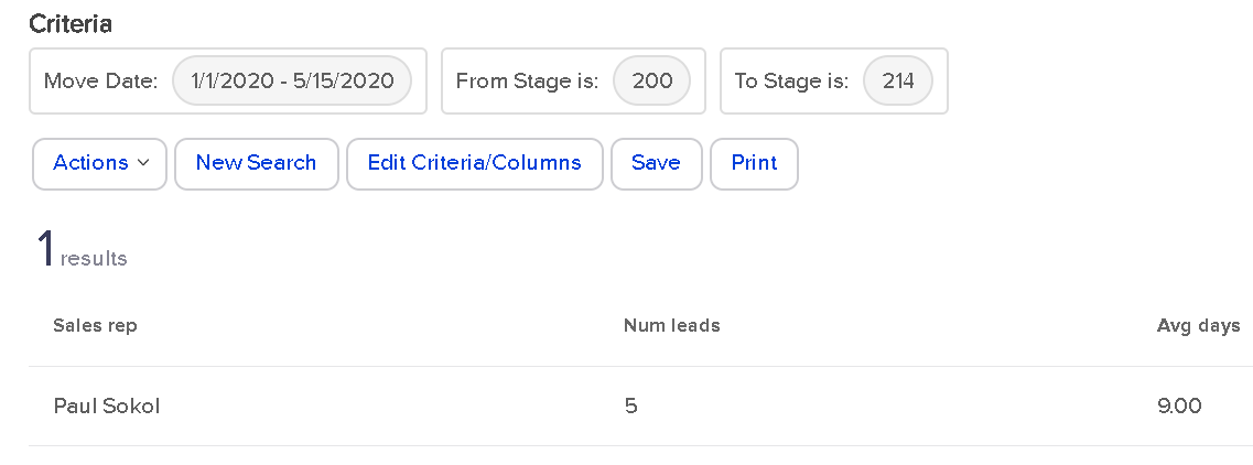
“What is the average number of days it takes someone to move from one stage to another?”

This report is short and sweet. Put in two stages and a date range. The report will calculate how long it takes, on average, to move from one stage to the next.

For example, for 2020 so far, there have been 9 leads that went from Qualified immediately to Assessment Complete:

Stage to Stage Report

In an average of 9 days.

However, if you look at people who went from Qualified to Proposal Sent, which only happened once, you’ll see it was a fast journey for that one lead.

Stage to Stage 2

If there were multiple sales reps in this application, each one would have a row in the report. This means the report is also great for establishing team baselines.

(Back to Top)

Opportunity Created Detail:
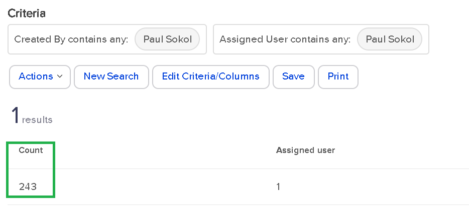
“Who is creating opportunities and/or who are they being assigned to?”

This report is a bit of a wild one. It deals only with opportunities created by a User, not automatically.

For every User-created Opportunity, who has been assigned to it?

As a one-man sales team (for now), this report tells me that I’ve manually assigned myself over 200 leads:

Opportunity Created Detail

That’s pretty wild. From a real-world standpoint, there might be some use cases for looking at who is creating and assigning. For larger sales teams, this could be super handy to track multiple managers and their teams. Especially if the managers are creating the leads for their team members.

Call History Summary:
“How many notes are my sales reps leaving?”

This report is great for managing a team.

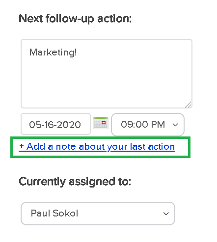
When “properly working” an Opportunity, this report will show sales reps activity. We consider working an Opportunity with the following button “proper”:

Call History Summary

This is for 2 reasons:

  1. This function will leave a digital papertrail Note on the contact record. You’ll be able to see what was supposed to happen, and then what actually happened.
  2. This function will update the User’s calendar for easier pipeline management.

Please note that working an Opportunity from My Day view will also behave in such a way.

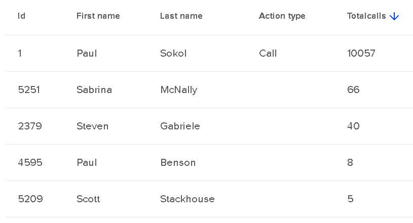
Ok, assuming your sales team has been been trained to use Opportunities “properly”, this Sales report will look like this:

Call History Summary Team

This screenshot above is for the entire app’s existence. In the close to a decade this app has existed, I’ve left over 10k contact notes of the ‘Call’ type; these are the default note type when working an Opportunity. You can see that a few other people have lightly used Opportunities in this app’s career.

As a sales manager, you can use this report to keep track of call volume per sales rep on a weekly, monthly, quarterly, etc. basis.

Call Log Report: “What notes are my sales reps leaving?”

This report is great for digging into sales rep performance and quality of call notes.

It is basically an expanded version of the previous report. Instead of spitting out the number of calls made, this allows you to look at the call notes directly.

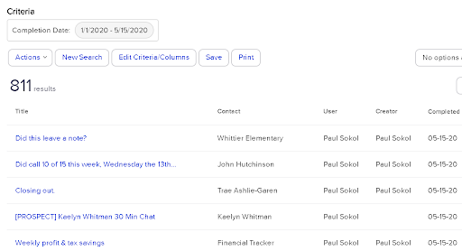
For 2020, I’ve “made 811 calls” or rather, worked opportunities 811 times:

Call Log Report

It is important to understand that these reports are reporting on the Contact notes. So as long as your sales reps are leaving notes, this should show their activity.

(Back to Top)

Sales Pipeline Summary: “What pipeline movement happened during a certain date range?”

This report is pretty cool. You can see a breakdown of all stage moves INTO a stage, and then all the resulting moves OUT.

This is handy to see where people are getting stuck in the sales process. And with what velocity.

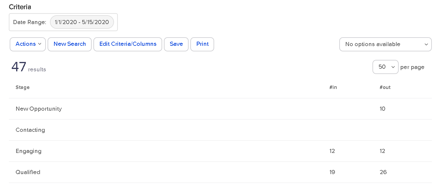
Sales Pipeline Summary

For 2020 so far, I’ve had 10 sales leads created in the New Opportunity stage that exited that stage. That doesn’t tell us much.

Could some leads be sitting in New Opportunity that haven’t moved? Yes. That would be the job of the sales manager: to monitor and make sure this isn’t the case; which it isn’t.

Look at the Engaging stage though. All 12 leads that entered that stage moved out of that stage. This means people aren’t getting stuck there. This can also be interpreted as no Opportunity was created in that stage. As long as nobody is still in Engaging (they aren’t), then, yes, that is the case.

For the Qualified stage , how can 26 move out when only 19 went into that stage? This means there were 7 opportunities created in the Qualified stage from the get-go. At least.

As you can see, this report starts to get down to the brass tacks of pipeline efficiency.

There are no search parameters besides the time range. This is global for all Opportunities in that time range.

However, you can filter by Team, which is a group of Users. If you wanted to see individual sales rep performance, you could create a unique Team per sales rep and use it in this report.

Sales Pipeline Detail:
“What specific pipeline movement happened during a certain date range between stages?”

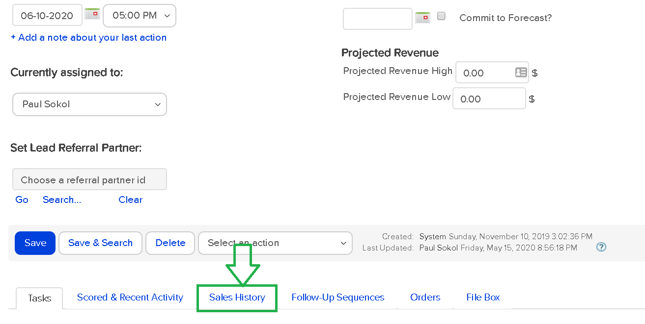
This report is super insightful. You can get lost in rabbit holes for sure. This report is how you can search between the individual Stage Moves; the Sales History tab of the Opportunity record.

Sales Pipeline Detail

This report lets you see global stage movement, all movement FROM a particular stage or, all movement TO a particular stage.

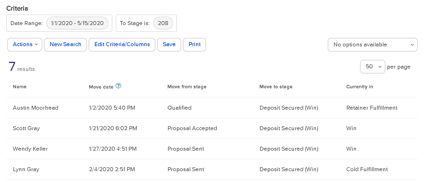
For example, here are all the stage moves for 2020 that ended in the Deposit Secured stage:

Sales Pipeline Detail 2

You can see that most people were in a proposal stage before becoming a paying client. Which makes sense. This also shows what stage the Opportunity is in right now.

For this example, since two of the stages are in Win, that means those projects are closed out. Otherwise they would still be in a fulfillment stage.

Like the Sales Pipeline Summary report, you can only filter by Team. So if you wanted to look at individual sales rep activity, you’d have to make them into their own Team.

(Back to Top)

Opportunity Revenue Forecast:
“How much money is in the pipeline and what are the weighted chances of closing?”

This report is the most intricate of all the sales reports, in my opinion.

To get data from this report, you have to be doing three things:

  1. You have to be using proper Product and Subscription listings.
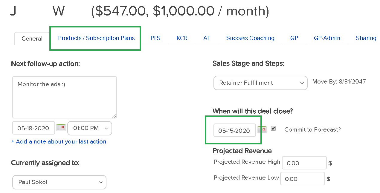
  2. Your sales reps have to be indicating what offers each lead is going to buy in the ‘Products/Subscription Plans’ tab of the Opportunity record.
  3. Your sales reps have to be using the Estimated Close Date field on the Opportunity record; ‘Commit to Forecast?’ is optional

For example, this Opportunity record has products listed and a close date:

Opp revenue forecast

The dollar value next to the name is a function of the products and subscriptions selected.

Assuming those three conditions, the Opportunity Revenue Forecast in Infusionsoft will spit out a report like this:

opp rev forecast 2

As you can see, I don’t use the Products/Subscriptions tab as good as I probably should. I am actually human after all 😉

But that works out for you, since it provides the perfect example for how this report works.

You can see the potential revenue and potential monthly subscription. This matches with the Opportunity record. You also have the option to filter based on the ‘Commit to Forecast?’ checkbox or not.

What’s with that weighted revenue stuff?

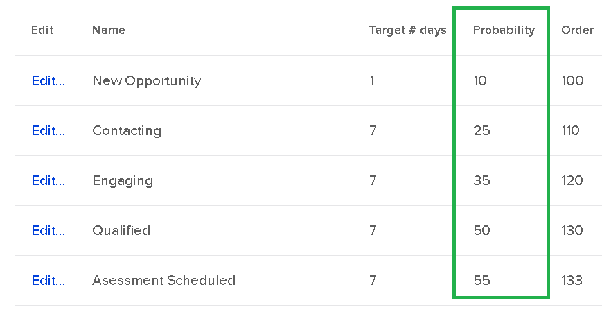
Glad you asked. That is a hidden fourth condition for the report to properly work. This is related to the Probability setting of each sales stage.

If you never noticed, there is a Probability field for each sales stage when setting it up:

Opp Revenue Forecast

This is the probability of the sale closing.

So the weighted revenue is the total Opportunity revenue times the probability of selling.

As an example, if someone was considering a $1,000/month service, and they were in the Qualified stage (with a probability of 50), the weighted revenue would only be $500; they are only half way through the sales process.

The reason both the potential and potential weighted revenue match in the screenshot above, is because they are an active client in the ‘Retainer Fulfillment’ stage; which has a probability of 100. They already bought and are a paying client.

This report is particularly helpful for sales manager dashboard stats that show pipeline volume.

Opportunity Sales Report:
“How much money did we actually make off closed opportunities?”

This report shows how many Order records exist for a Closed opportunity.

Which does not mean that every opportunity contributed to the sale.

That is what makes this report sometimes slippery. Especially if someone can buy on their own without talking to a sales rep for some Offers. There is a risk that an Order record is being “credited” to an unrelated Opportunity record.

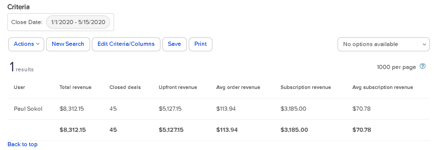
With that in mind, here is how the report looks:

Opp Sales report

This means that I’ve got 45 closed Opportunities this year for a total of about $8,300 in orders. And about $5k of that came from upfront revenue.

Nearly every Order is a function of our assisted sales process, so this is pretty accurate.

There is an extra gotcha: this report only shows “Closed” opportunities. It has to be in either the Win or Lost stage. Because I use stages for Fulfillment, beyond the sale, this report isn’t 100% accurate.

To be accurate, all closed projects for 2020 have driven ~$8,300 so far. There are still a handful of open projects including retainers who technically never “close” until they cancel their subscription.

Still, this report gives some interesting data on sales results per rep.

Sales Cycle Report:
“How long do opportunities stay open by sales rep?”

This report shows how many opportunities have gone from creation to a closed sales stage, and the average time to get there.

For 2020, this is how the report looks for me:

Sales Cycle Report

45 Opportunities have been closed out in an average of 141 days.

This doesn’t exactly tell me, specifically, the sales length though. Remember, I use sales stages for Fulfillment, so technically the Opportunity is active throughout the whole process.

If I wanted to see the specific sales cycle, I would have to use other reports to see the average time to the Deposit stage.

For a more traditional use of Opportunities, where the record is closed upon sale, this report gives a fantastic high level view of sales process velocity and efficiency per rep.

(Back to Top)

Opportunity Pipeline Summary:
“How is my entire pipeline doing?”

This report is the big mamba jamba. It’s the closest thing you have to a speedometer for your sales pipeline.

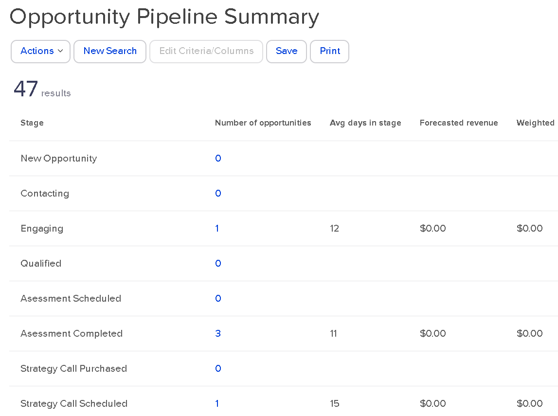
There are no settings for the search. There are no extra columns to add. This is a raw “What is so?” right now about your sales pipeline:

Opp Pipeline Summary

Right now, as of this blog post draft, I have one person in Engaging for 12 days so far. 3 in Assessment completed. And so on.

You can see I’m not adding in the forecast revenue to those Opportunity records. This is a great reminder to get into this habit. Even as a one-man show, the more data I have, the better 🙂

This report gives you a high level view of everything, right now. If I was a sales manager, I might use this report as a Tool to build the team as a whole. Keep everyone all on the same bus. Everyone wins together, and everyone loses together.

(Back to Top)

You made it.

Whew!

So there you have it. From the annals of an esoteric PDF produced in 2013, you now have a full-blown explanation of every single Sales CRM report for Keap. All twelve of them.

Arguably, one of the most thorough and rigorous explanations of the topic to date. 🙂

What do you think? What’d you learn? What questions do you have? Let us know in the comments below.

Reacting or Responding

Reacting or Responding

The difference between reacting and responding

What do you do when something goes wrong?

I’ll tell you what I do in a minute, but first, think about what you do.

Before you answer, think about how many times in a single day something goes wrong.

Maybe not terribly wrong, but from the unexpected, to the unbearable, how many times do things not go your way?

Probably a lot. And in business, the entire goal of your competition is to make things not go your way.

So in those moments, you have a choice of two things: you can react, or you can respond.

“Reacting” is what most people do most of the time.

It’s choosing to act on our initial impulses.

Impulses are non-voluntary. Something makes us mad, sad, frustrated, disappointed, depressed, we can’t help feeling that way. The impulse is okay by itself.

The problem is that most people then act on that impulse. And “acting” on an impulse is always physical. Our body language or verbal language is how we choose to express our impulsive emotion.

So we stomp our feet, throw our arms out, yell, roll our eyes, slump our shoulders, slam our laptop closed, or say something not so nice.

Those are reactions. When we react, we aren’t in control.

On the other hand, a “response” is a pre-decided choice.

It’s how we have decided we will act when something we’re already preparing for doesn’t go our way.

It’s deciding ahead of time that you’re going to encourage your sales rep after a dropped deal, huddle your team for the next month with confidence after a missed goal, hold your head up and face straight when you fumble an opportunity.

A response is the choice of leaders. A reaction is the impulse of a child (no matter how old we are).

So think about 3 things that are highly likely to go wrong this week. You know what they are. They are common mistakes that happen as a entrepreneur – lost deals. Missed deadlines.  Tech issues. Short cashflow.

(Why do we seem so surprised by these things when they happen all the time, anyway?)

And visualize how you want to respond to those scenarios. See yourself acting the way you would want yourself to act to have people respect you the way you want to be respected.

Now, pre-record that response in your brain, and when the time comes, and it will come, acknowledge your impulse to throw a fit, shout or yell, or slump your shoulders and feel sorry for yourself, and then choose to ignore your impulse and select your already-recorded response.

The response that makes you look like a real leader.

Because if you’re going to be a real leader, you have to act like a real leader which means you to have to prepare ahead of time to act like a leader when stuff goes wrong.

Think about it. Apply it this week and see how you feel and what it gets you.

Oh, I promised you I’d tell you what I do when something goes wrong. Well, as a leader of a lot of people, a lot of revenue and expenses, as well as my own family, I can tell you things don’t go the way I want every single day.

I do three things:

  1. Prepare ahead of time for surprises so I’m not surprised.
  2. If I need to be angry, or sad. I do it alone then get myself back together.
  3. I project calm confidence. Then I prepare better to not let it happen again.

I hope that’s useful for you. If you try it out, I know it will be.

Editor’s Note: Fun fact – Justin originally wrote this blog post as an email to his list for a business he runs training youth quarterbacks, but when I read the email I felt like the parallels for small business were uncanny, so I adapted it. Just reread it and replace the word “business” with “football” and you’ll see it works for that lens too.